PRODUCT design Case study

Banter.com - A new digital experience for the rebranded omni-channel retailer

PRODUCT design Case study

Banter.com - A new digital experience for the rebranded omni-channel retailer

PRODUCT design Case study

Banter.com - A new digital experience for the rebranded omni-channel retailer

Overview

A retail heritage brand in need of a digital revamp

Banter.com is a specialized e-commerce platform offering a wide range of piercing jewelries. It's not just a shopping portal; it also serves as an educational hub for all things related to piercings, piercing methods, types of jewelry metals, and more.

Design Goal

A centralized information hub for both e-commerce and in-store customers

The primary objective for these pages was to cater to both online and retail customers effectively. For e-commerce consumers, the focus was on providing detailed information about products, particularly for high-value items, to inform their purchasing decisions. Meanwhile, retail shoppers have the option to explore product details independently or with the guidance of a sales associate. This feature serves to enhance their in-store experience and offers a valuable resource for post-purchase aftercare and product knowledge.

The Challenge

-Poor browsability
-Outdated and inconsistent design
-Lack of design system

Initial research revealed that the existing pages were poorly interconnected and mainly served as SEO landing pages without contributing to the user journey. Even with 70% of site traffic being new users, these vital educational pages were practically invisible.

Furthermore, without a design system in place, all paged utilized various inconsistent modules and stylings, resulting in a poor experience across the board.

The Proposal

An intuitive browsing experience for both e-commerce and in-store customers

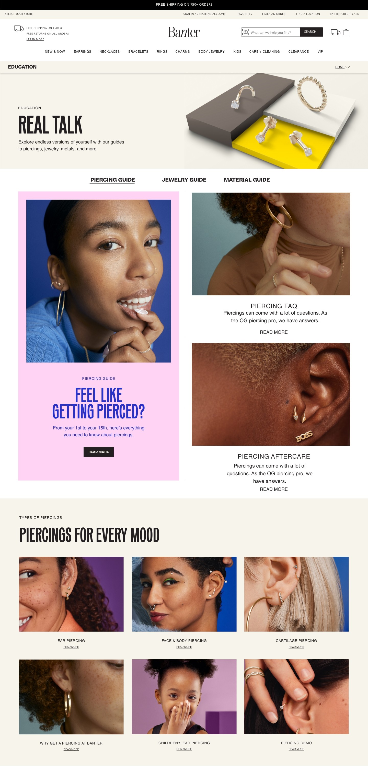
I revamped the website's structure from the ground up, focusing on a redesigned information architecture. This redesign introduced intuitive navigational UI elements, enhancing the user experience by facilitating smooth transitions between various educational and informational pages. This approach aimed to streamline user journeys, allowing for easy backward and forward navigation across the site's diverse content.


Step 1:
Audit & Prioritization

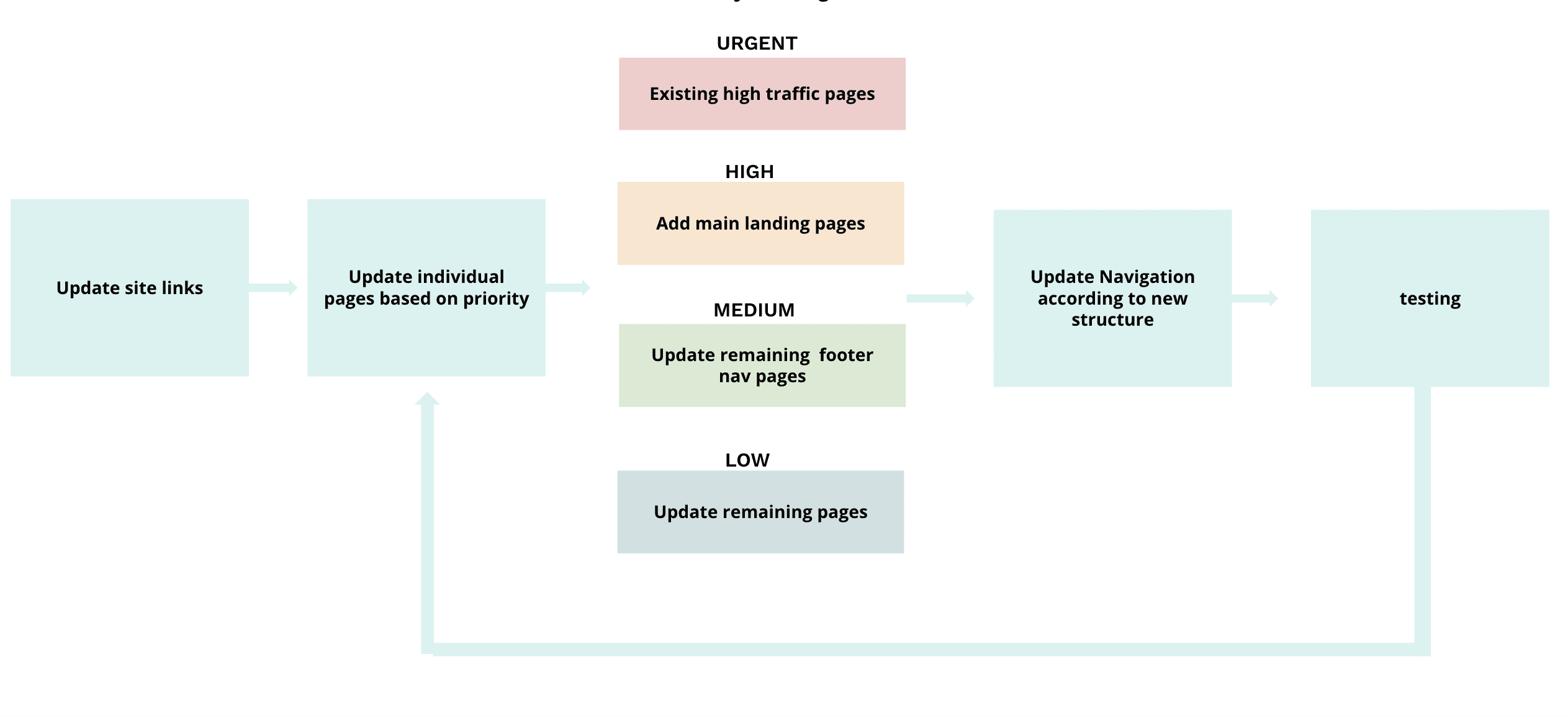
Conducted a comprehensive audit of the website due to its non-downtime policy.

  • Implemented updates incrementally, focusing on high-traffic areas.

  • Prioritized updates based on website traffic, user needs, and stakeholder requirements.

Step 2:
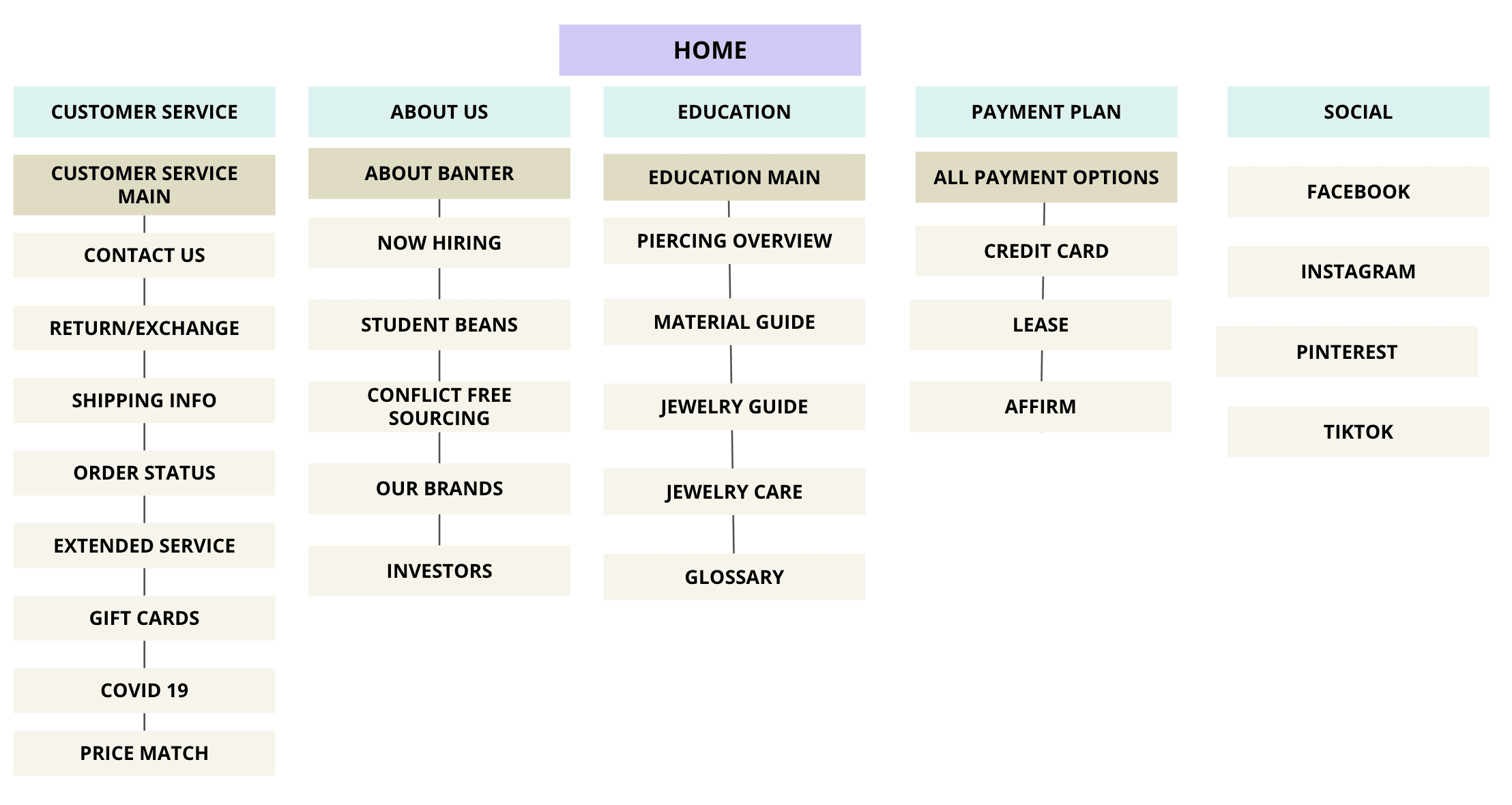
Information Architecture

Utilized heat mapping and insights from UX team research to understand user behavior.

  • Proposed a new information architecture for a clearer hierarchy of information.

  • Aimed to improve the overall browsing and shopping experience on the site.

Step 3:
Design System

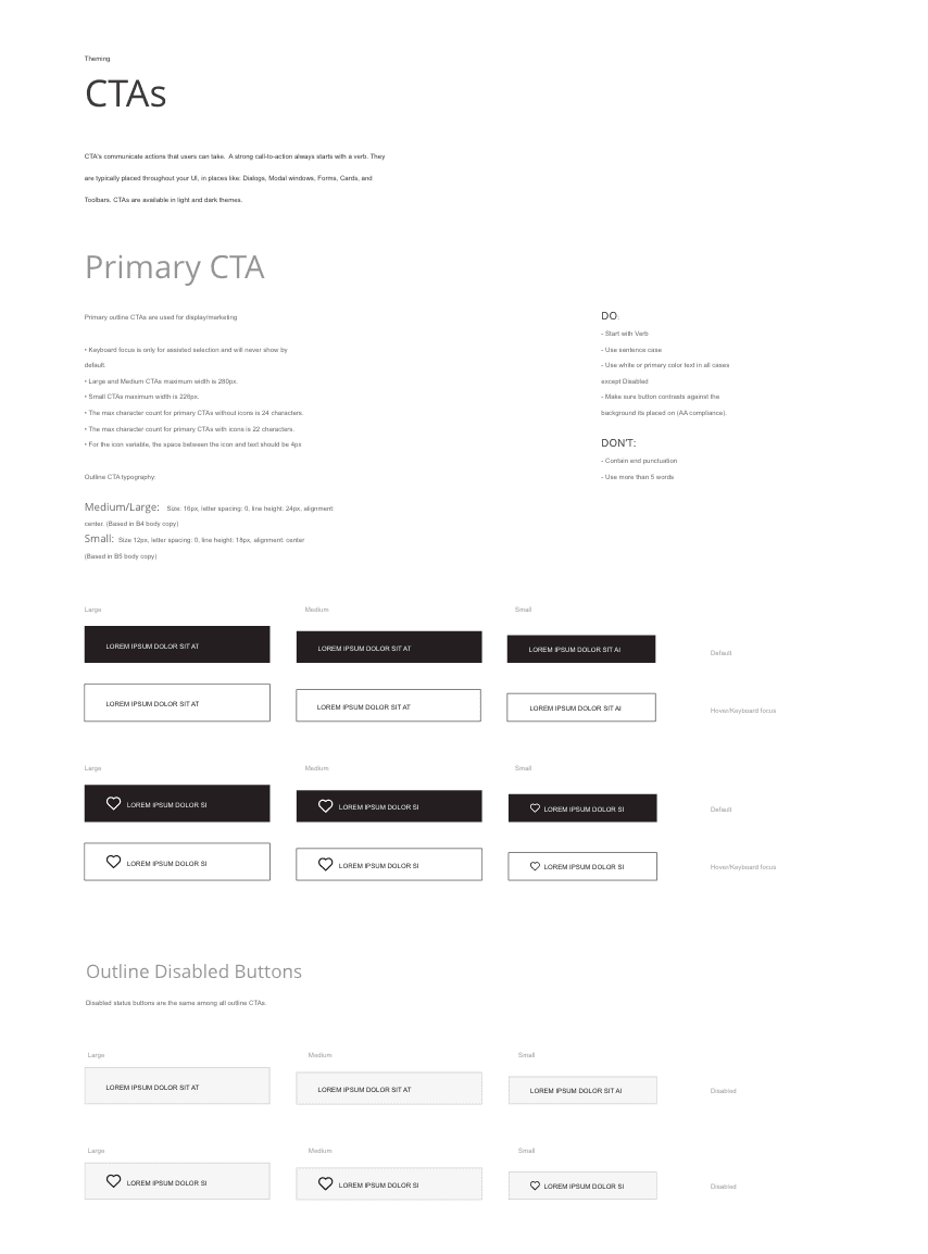
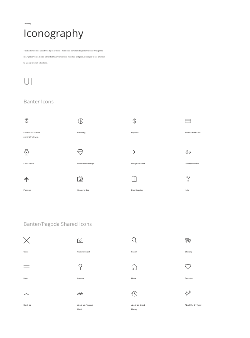
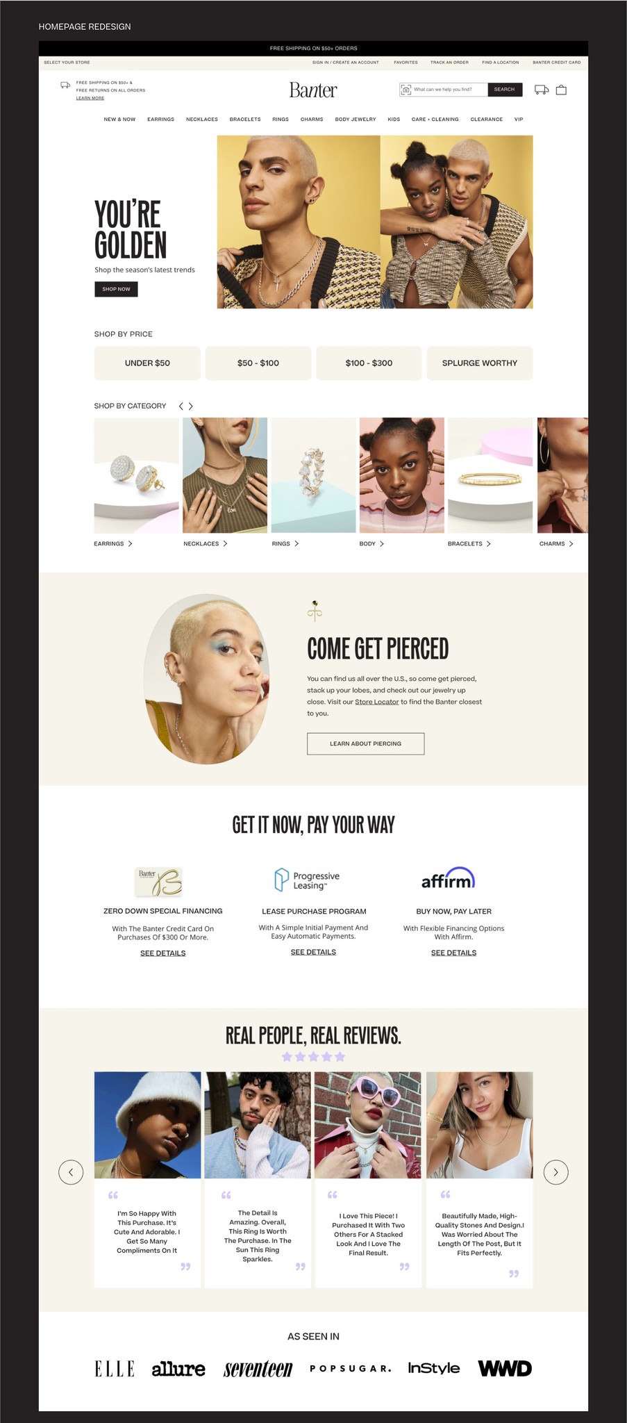
With a focus on creating a cohesive look and feel to enhance user interaction, we established Banter's very first design system ensuring consistency across the site, and utilized it as the foundation of our redesign.

  • Colors:
    Defined a set of colors that worked in both light and dark modes. With an emphasis on accessibility, we ensure all color combinations were ADA compliant.

  • Typography:
    Taking a less is more approach to simplistic typography to enable clear hierarchy and consistency in design.

  • Components:
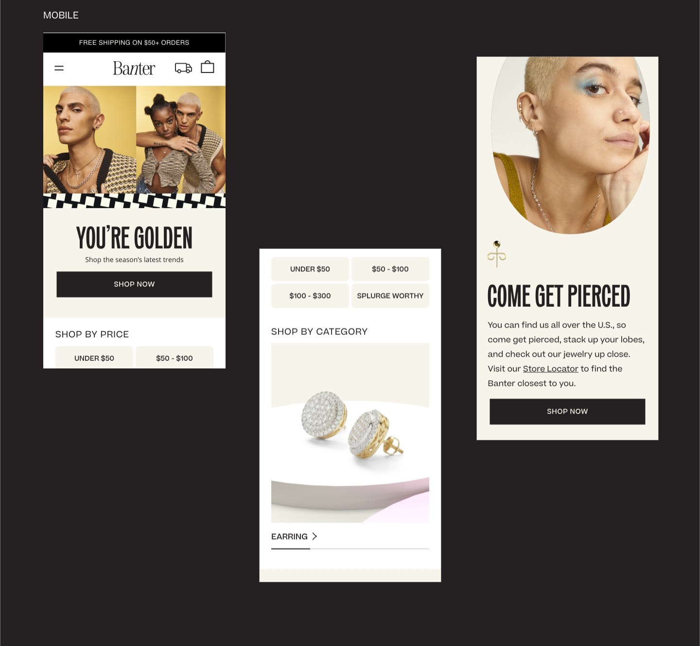
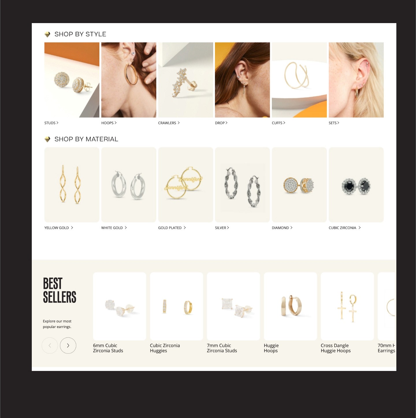
    Reusable UI elements such as buttons, sliders, and cards were designed to maintain uniformity.

Step 4:
Designing the Information Hub

With the design system in place, I went on to create the core pages.

  • Began with redesigning the local navigation.

  • Created all new site pages, adhering to the established priorities and design principles.


CENTRALIZED EDUCATION HUB


CENTRALIZED EDUCATION HUB

CENTRALIZED EDUCATION HUB

Step 5:
Rollout of Design Across the Site

Implemented the updated branding and design system across the entire site, and ensured a consistent and seamless user experience throughout the website.