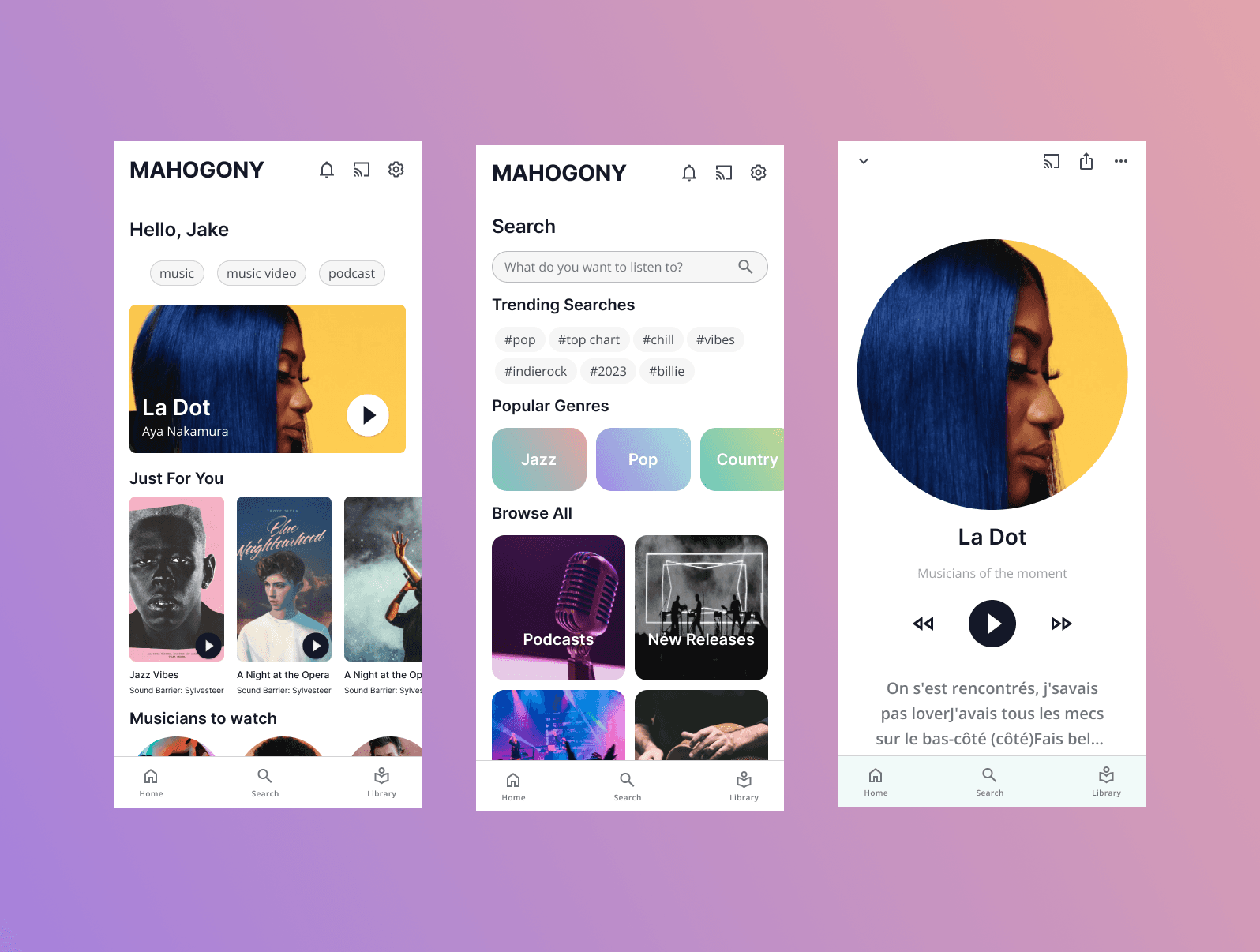
Process
1.Benchmarking:
Our first step was to examine existing players in the market. Platforms like Spotify and Amazon Music were natural benchmarks given their success and user base. However, we also wanted to expand our understanding of UI and incorporated insights from non-music apps such as Shuffle.
Key findings:
Simplicity was crucial. Overwhelming users with options could deter them from the discovery process.
Focus on Discovery and Play: The core action should be streamlined – listening to and discovering new music.
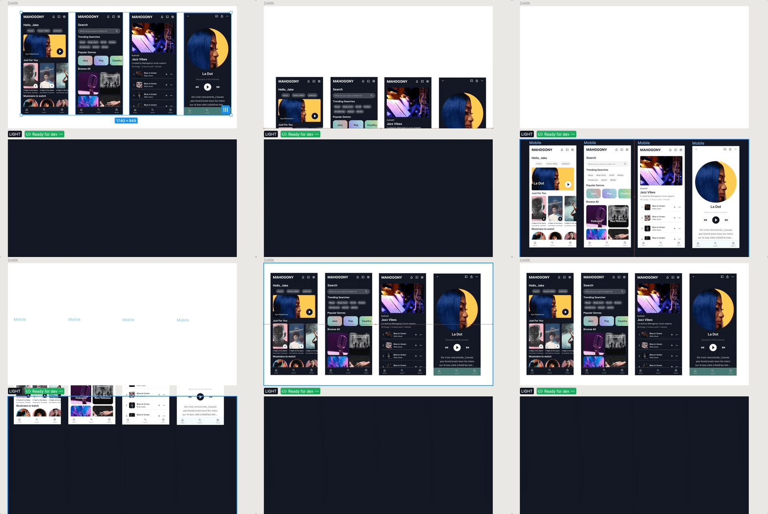
Adaptive UI: Offering both light and dark modes allows users to adapt their experience to different environments and personal preferences.
2. Information Architecture:
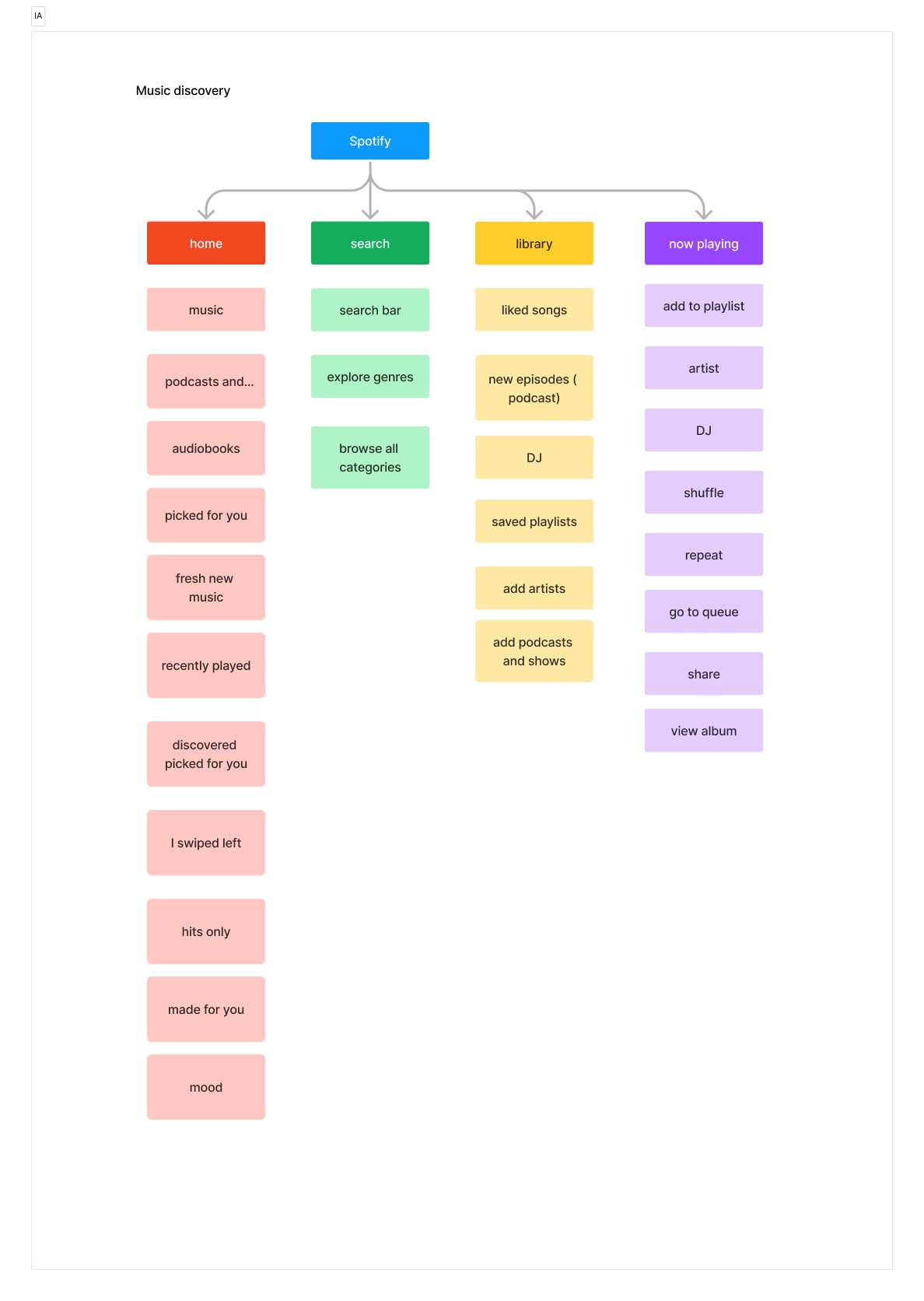
With a central theme of discovery, we structured the app's sections as:
Home: Featuring personalized recommendations and curated playlists.
Search & Discover: Allow users to look for specific genres, artists, or tracks and get recommendations.
Library: User’s saved music.
Settings: User preferences, including theme mode toggle.
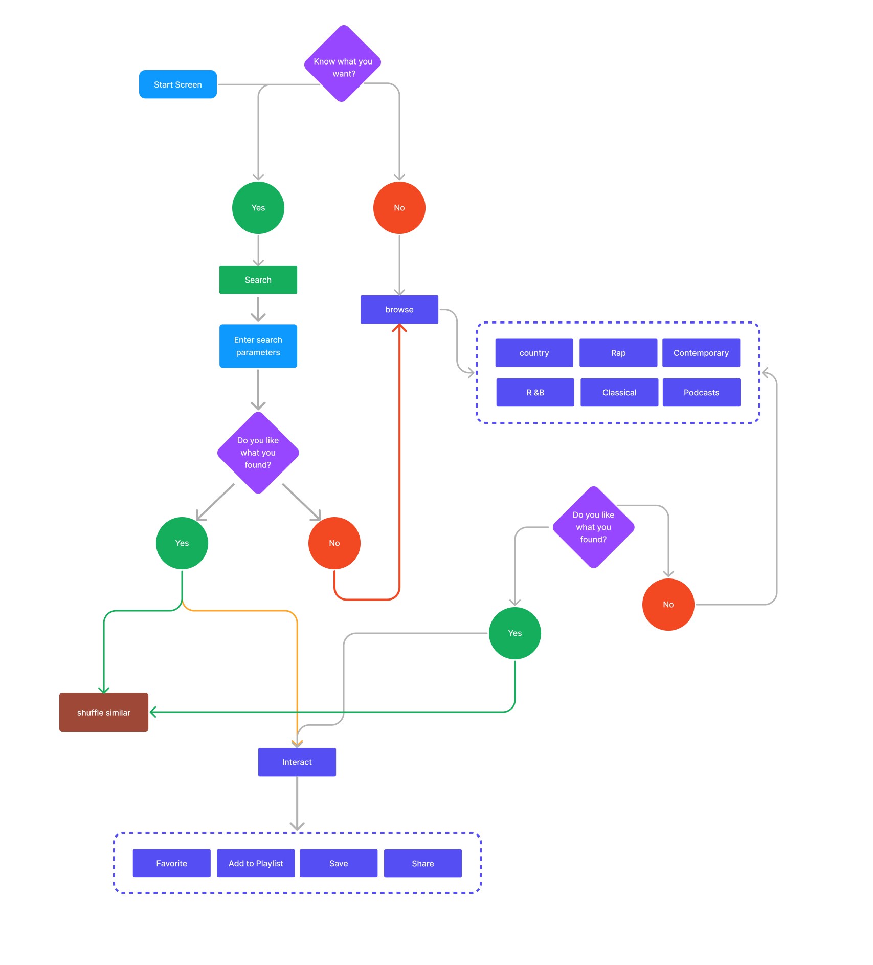
3. User Flow for the Discovery Journey:
Start on Home: Users are greeted with personalized recommendations based on previous listening habits and popular tracks.
Navigate to Search & Discover: A combination of search functionalities and discovery tools. Users can search or get lost in recommendations.
Personalized Recommendations: As users interact more with the app, recommendations become more tailored.
Save & Play: Users can instantly play music, save it to their library, or add to a playlist.
4.Wireframing
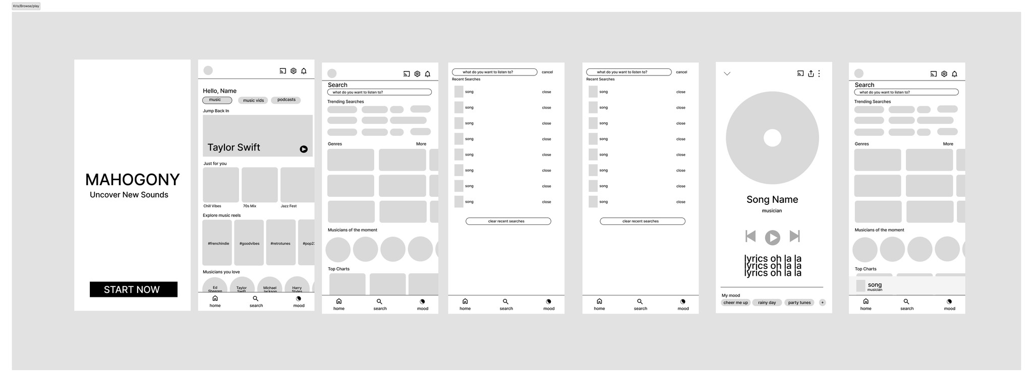
Before delving into high-fidelity designs, we drafted wireframes for each screen. This allowed us to visualize the user flow, positioning of elements, and the interactivity of the app. Feedback was sourced at this stage to ensure user-centric design decisions.
Design System
We established a robust design system ensuring consistency across the app.
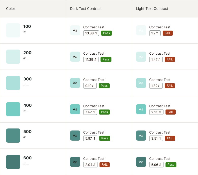
Colors:
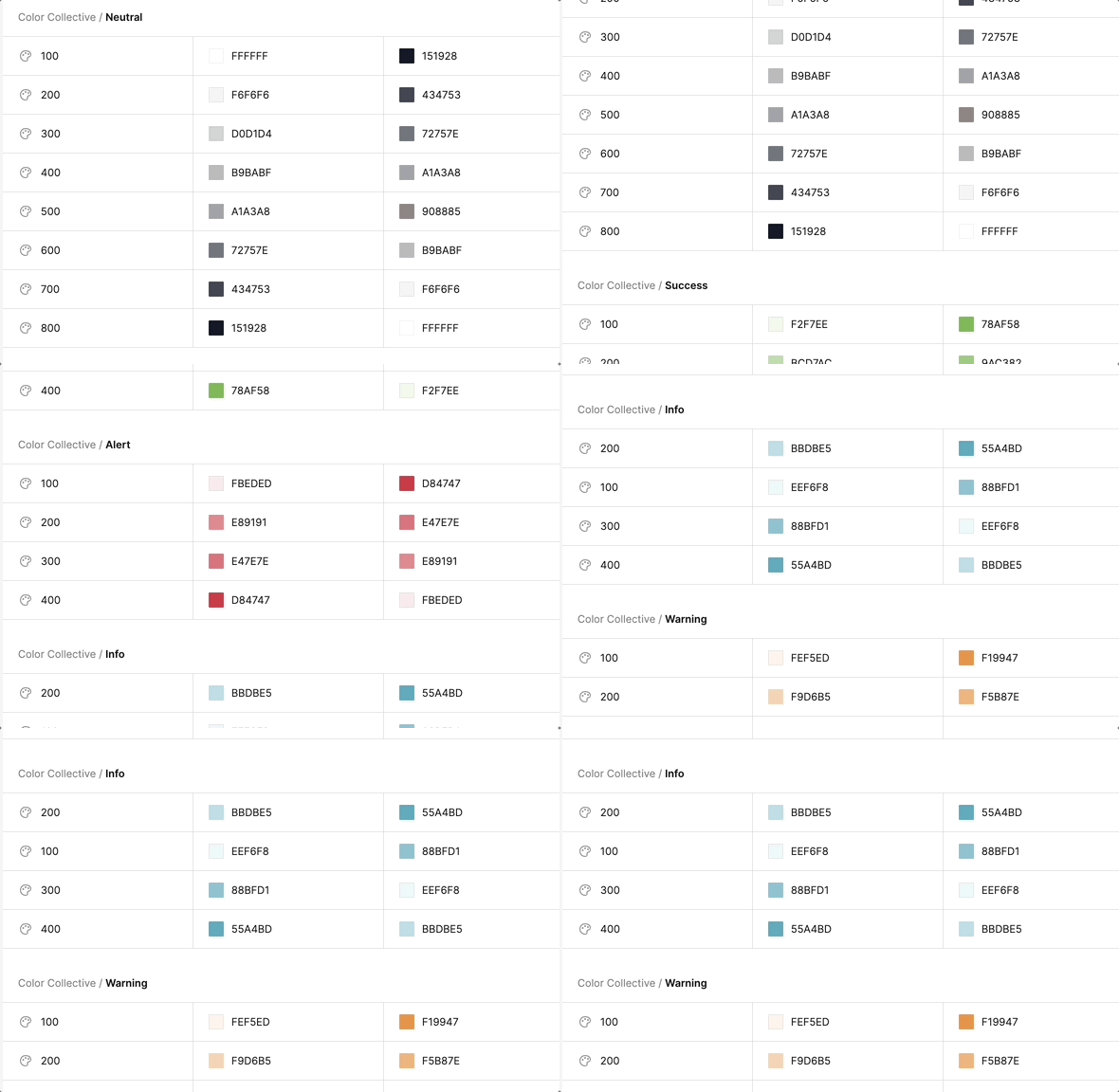
Defined a set of colors that worked in both light and dark modes. With an emphasis on accessibility, we ensure all color combinations were ADA compliant.Typography:
Taking a less is more approach to simplistic typography to enable clear hierarchy and consistency in design.Components:
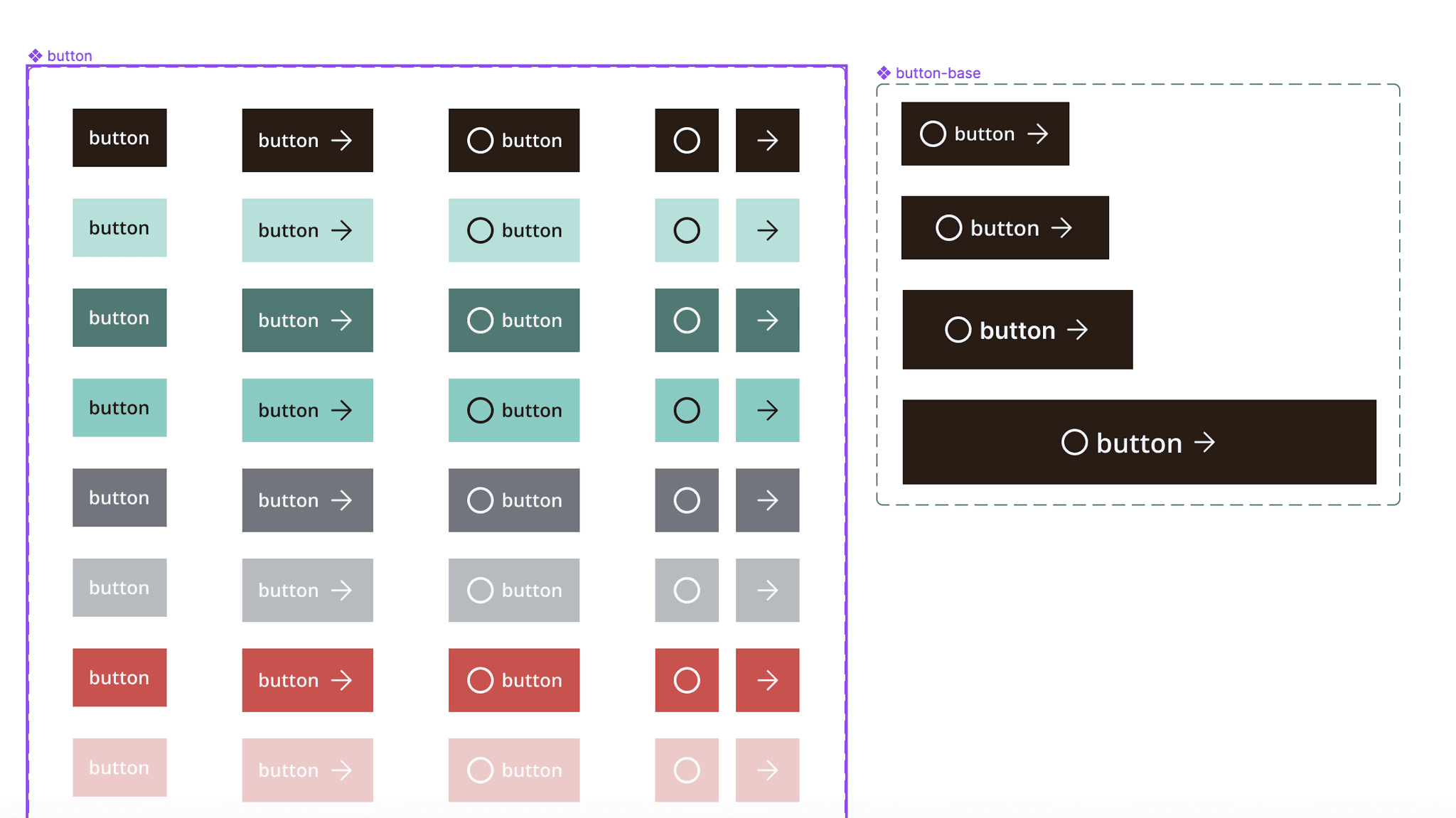
Reusable UI elements such as buttons, sliders, and cards were designed to maintain uniformity.
